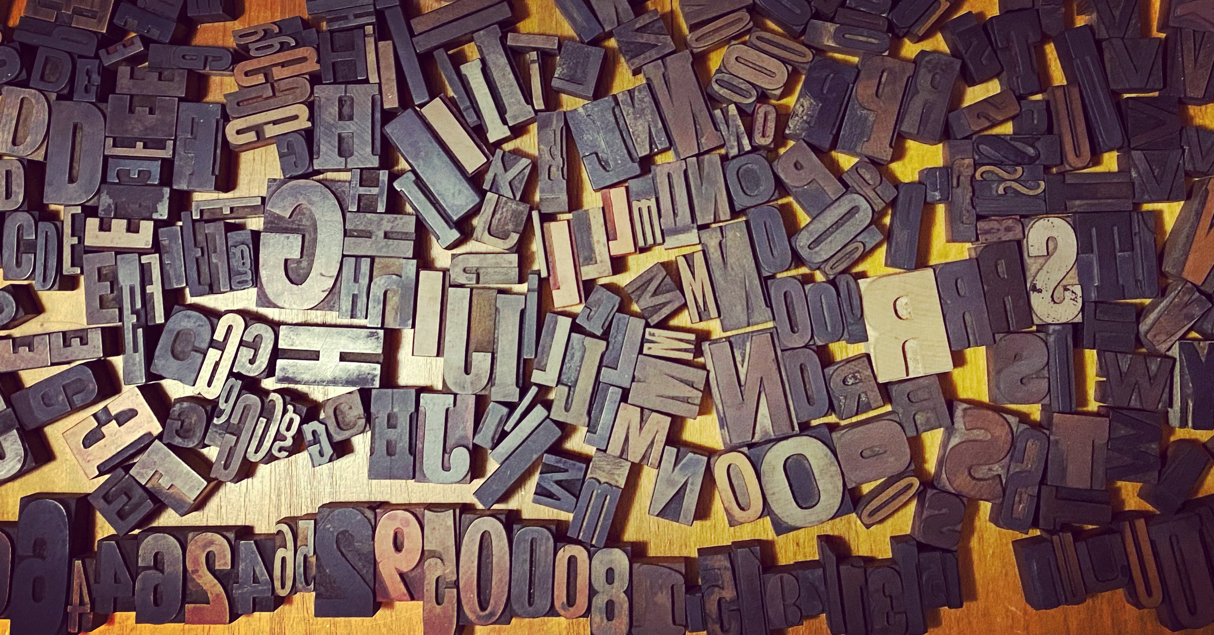
Letterpress, TYPE, and Printing Articles


Before you ask, no, I didn’t write that Economist article about letterpress, titled “How the world’s old printing presses are being brought back to life”! It’s a magnificent piece, focusing on The Type Archive in London, explaining how Monotype hot-metal composition works, and bringing in some excellent insights from Japan. It was written by a senior Economist editor, and it’s such a solid account of the subject and so good for a general audience without specialized design or letterpress knowledge. It’s even headed in hot-metal Albertus, a typeface I love dearly, and the history of which is well represented at the Type Archive.

I visited The Type Archive and the St Bride Printing Library in London in late 2017 and wrote a book called London Kerning that includes several of the people featured in the article: Sue Shaw, Bob Richardson, Duncan Avery, and Richard Ardagh. (The print run of the book is sold out, but the ebook remains available.) My book goes into great depth about the collections of both institutions, as well as working letterpress printers and type designers in (or formerly in) London. It includes a section on the Doves Type, created by Robert Green, who covered some of the historic Doves Press type noted in the Economist story from the Thames where one of its owners had thrown it.
I thought I’d use the Economist story as a jumping-off point to collect in one post all the articles I’ve written in the last decade about printing, type, and letterpress, past and present—and about its future.
Letterpress, past and present

- “How Letterpress Printing Came Back from the Dead” for Wired (2017). Letterpress looked like it was on its last legs, but a combination of a revival of craft interest coupled with the introduction of certain digital technology have helped give it new life.
- “Erik Spiekermann makes a deep impression by marrying new to old,” self-published at Medium (2017). The well-known, veteran designer and type guru developed a new system for what he calls “digital letterpress,” that combines the flexibility of digital design with the integrity and quality of letterpress printing.
- “Computers' unlikely mechanical antecedents” for the Economist (2011). A look at Monotype hot-metal composition at the C.C. Stern Type Foundry, a museum full of working hot-metal typesetting systems in Portland, Oregon.
- “Debossed, yes. Debased? Maybe” for the Economist (2011). Apple offered partially letterpress-printed greeting cards for a while, sparking these thoughts about what modern folks expect when they see (and feel) letterpress printing.
- “A California Type Foundry Is Keeping Vintage Printing Alive” for Atlas Obscura (2019). The Grabhorn Institute in San Francisco preserves two working pieces of printing’s past: the M&H Type foundry and the Arion Press, which produces fine-art books.
- “Have press, will travel” for the Economist (2011). An itinerant printer took her van around the country to speak, print, and share.
printing history

- “When Typewriters Attacked,” a post for patrons at Patreon (2019). In October 1919, the typesetters, printers, and page feeders at most of New York City’s “job shops,” which handled magazine and miscellaneous business work, staged an “unscheduled vacation.” A form of wildcat strike, unauthorized by the local or international union, these printing folks wanted $50 a week for 44 hours of work. Hundreds of magazines were affected. Some hatched a plan: instead of typeset text, they would use…typewriters! This story has barely been told in the century since.
- “Flong Time, No See,” a post at Medium (2019). An unheralded bridge technology known as “flong,” a kind of papier-mâché, allowed faster printing of typeset pages. Flong disappeared along with relief printing, and it’s a critical but forgotten part of printing history.
- “Deckle detecting” for the Economist (2012). Why does Amazon warn its customers about rough edges on books?
- “Bogus! When Typesetters Were Paid To Set Copy That Was Thrown Away,” a public post at Patreon (2019). For a century, typesetting unions had deals with management that made it unappealing for businesses to try to hire out composition and bring it in for printing, particularly in newspapers. That practice let to a Supreme Court decision, odd rules, and a set of printers in New York with jobs guaranteed for life after a deal arose to end the practice forever.
- “The paper that poisoned its printers” for the Economist (2018). A newspaper entrepreneur figured out how to print a golden-hued portrait of Queen Victoria on her coronation in 1838, but its impact on the printers was largely ignored.
- “CAPITAL CRIMES, PART 1 : SHOUT, SHOUT, LET IT ALL OUT” for Meh.com (2017). I looked into the history of shouting in all capital letters, tracing it back so far to 1856.
Typesetting, type design, and type history
- “The most-read man in the world” for the Economist (2010). A paean to Matthew Carter on the award of a MacArthur Fellowship. His typefaces are among the most widely used in the digital world.
- “Aligning a Rocky Road,” a post at Medium (2019). Before the phototype and digital era, how did type foundries develop standards so that type could work together? They didn’t! Until the rise of mechanical typesetting provided the prod. By the late 19th century, three key components of type were finally largely agreed upon.
- “Meet the Font Detectives Who Ferret Out Fakery” for Wired (2017). Thomas Phinney found a profitable sideline (now his main occupation) in testifying about the validity of documents based on the characteristics of their printing and typefaces used. Many a plan has been foiled by fonts that postdate a document’s alleged point of execution.
- “True to type” for the Economist (2014). A breakthrough in Web type standards allows ready usage.
- “Over the rainbow” for the Economist (2013). Digital type goes all colorful.
- “That London Tube typeface? Look again,” a post at Medium (2018). An examination of all the different typefaces that have passed as the one that we think of as the London transportation system’s unique font.
- “Chromatic Type,” a post at Medium (2018). The past is full of color if you know where to look.
- “When newspaper compositors were sporting heroes” for the Economist (2018). People would pay to come to competitions at which typesetters would try to set text a character at a time as fast as possible.
- “A Collation of Facts Relative to Fast Typesetting,” a post at Patreon (2018). A modest book about typesetting races in the 1880s reveals a lot of useful insight into a pivotal period of printing history.
- “Collecting String,” a post for patrons at Patreon (2019). Typesetters were paid piecework by measuring pasted-together proofs.