Not a Double Space, Full Stop

I was reminded today of a particular writer who is known for his precision, and wrote a book that was rather about that. I bounced off the book when I reached page 22, and found the following (including the abomination of indented footnotes).
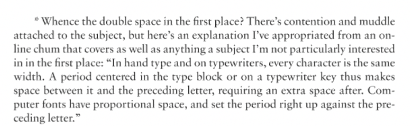
I know of many fights over putting two spaces after a full stop, but the explanation above does a disservice to observation and history. It escaped the interest of the writer, but also apparently the editor, copy editor, and, perhaps, even the proofreader, as those must have existed for this particular book, and should have all known it was false.
First, remember what Ted Lasso said about bullies (see end of post) when you read the lead-in to the footnote above: “All them fellas that used to belittle me, not a single one of them were curious.…Curiosity helps you understand people instead of judging them, because if they were curious, they would ask questions.”
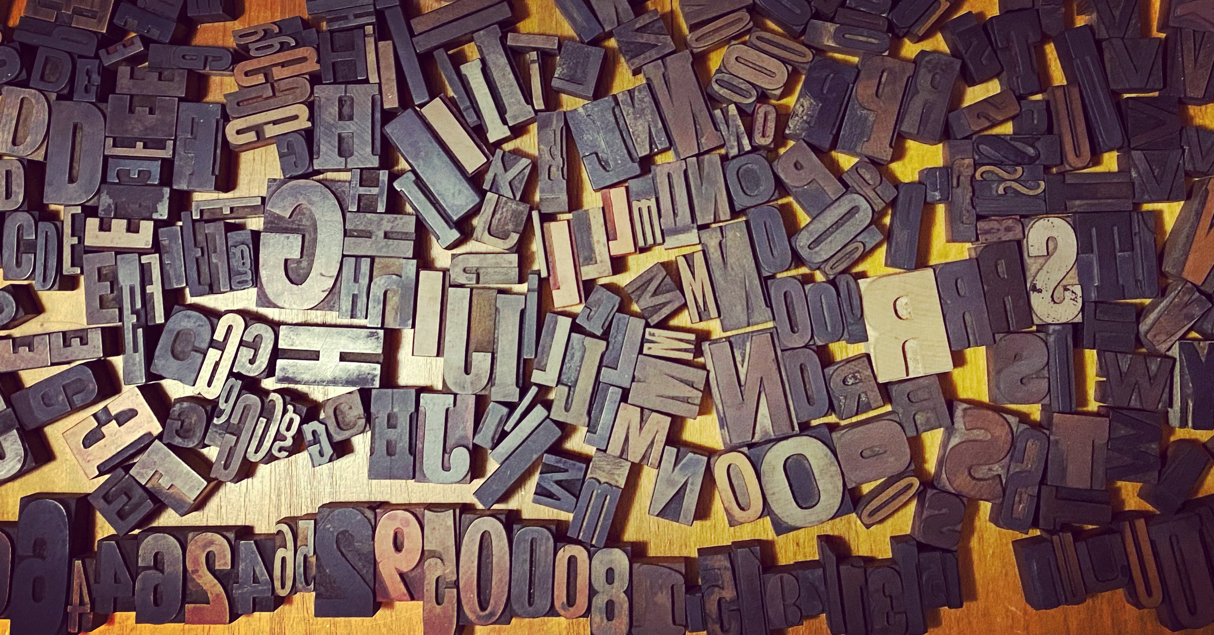
Second, a typesetting observation: Find any book from the 1940s or earlier—and many from the 1950s and 1960s—and it was set by a hot-metal machine, likely Monotype. Go back to the 1890s or earlier, and just about every book was set by hand. Scans of such books are readily available for free viewing. Of course, neither handset nor machine set type had every character the same width, with the printable part centered on the body; that would be ridiculous. Type from Gutenberg to the present has nearly always been designed with a width appropriate to the letterform.
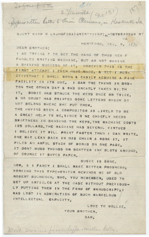
Third, a typewriter observation: It is true that typewriters were typically designed with uniform width, so that characters on the typebars filled out the edges, but the period was not centered—it was to the left, so that it looked correct at the end of a sentence or after an abbreviation. There are endless typewritten pages available to look at online as well, if one doesn’t have a convenient atavistic typewriter. Later, fancier typewriters added variable widths, like the IBM Executive (1940s), allowing for a more natural spacing; later models could even be used for typesetting, like the IBM Selectric Composer (1966).
So this is observably false.
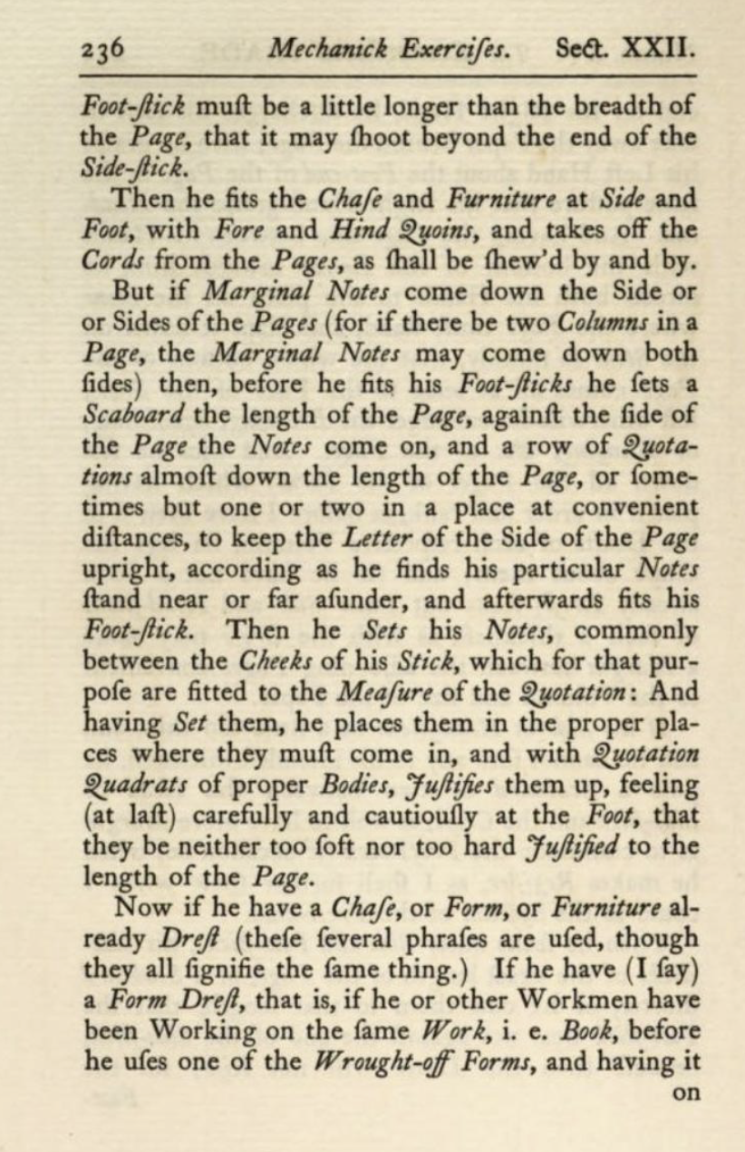
Now for the history. Cast your eyes back at older books. For instance, Joseph Moxon’s legendary 1683 text, Mechanick Exercises Or, The Doctrine of Handyworks Applied to the Art of Printing…, a work that explained everything about setting up and running a printing establishment, including building every component required.
The interword spacing is somewhat larger than we’d typically like today, but look at the oceans of space after the period or full stops, and even after the i.e. abbreviation for id est. You could take a lovely dip in the pool formed by that white space. A casual glance at older books would reveal that, until around 1900 and even later, a wide space, maybe a full em space was common. (That’s the width of the letter M until the late 1800s, then the width of the point size).
In another bit of easily discoverable history, either Gutenberg, someone at his studio, or a typefounder shortly after developed the single most extraordinary part of movable type: a mold for casting pieces of type that could be easily adjusted to the width of the character. The foundation of European-originated movable type printing is in revolt against the footnote above.
Further, typesetters were paid by the length of the material they set—by the em in the United States and apparently by the en (the width of an N or half an em) in the United Kingdom, at least in some shops. Typesetters had no interest in reducing the width of the post-punctuation space, because why reduce their earnings? And it wasn’t the style of the time. This lasted in places until the early 1900s, displaced by hourly wages with the emergence of mechanical setting.
As far as I can determine, the style of “double space” qua “double space”—i.e., pressing the Space bar twice on a typewriter, as a typesetter had no bar, and a compositor would never press one twice for mechanical and other reasons—emerged as a style of typewriting and manuscript preparation. Typing manuals in the hundreds have been digitized and can be readily found from every era—there’s that missing curiosity again. They explain exactly how many spaces to put after a period: two. In cases of manuscripts, this was explicitly to ensure a compositor knew an end of a sentence was intended, ensuring the wide space common until the 20th century, as I note and show above!
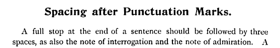
But sometimes—it was three spaces.
(I leave discovering the work to the reader, for I do not recommend it. I put the book down after page 22, and later bounced not only off the work, but off the author when he was absurdly, unnecessarily rude to me on social media.)