Senior Project: A Version of Wolpe’s Albertus

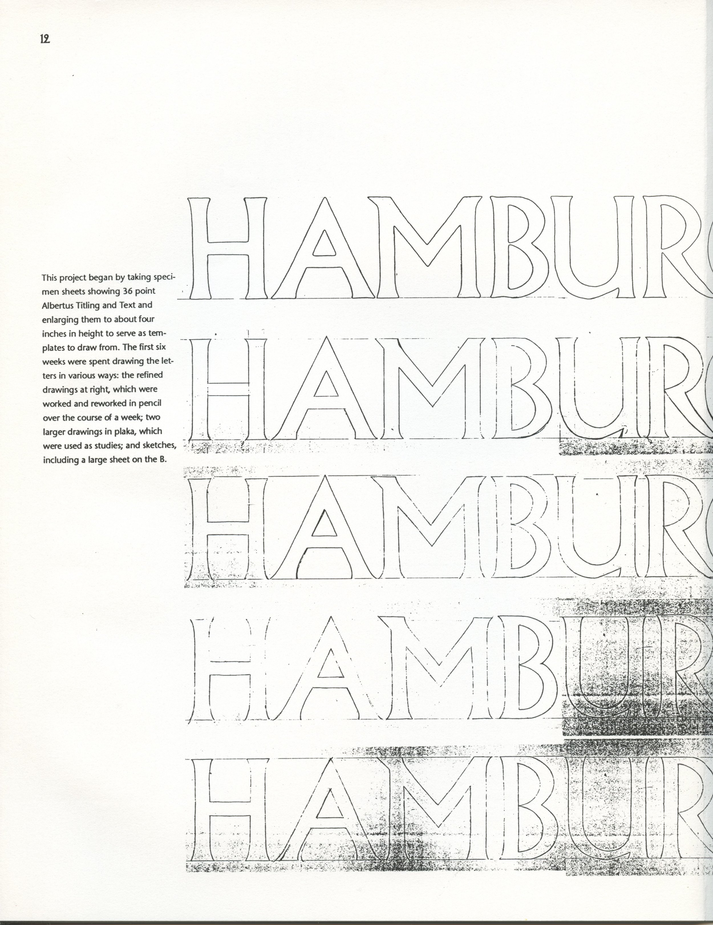
Searching for old photos recently, I uncovered my senior project in graphic design. I majored in Art at Yale with a subject concentration in graphic design, and this work was my part of my graduation requirement for the major. I had a strong interest in type design, and was encouraged by a mentor to produce a high-quality digital version of the typeface Albertus. Albertus had been designed in the 1930s by Berthold Wolpe, and it was one that in the late 1980s wasn’t yet available in a strong digital rendition. I’ve scanned the project for my own posterity and you can download it here. Missing, sadly, are pictures of the large exhibition posters that I created as part of my project.
You can see the child of the adult in this writing. My style has changed a bit over the year, but I think it’s matured rather than transformed!
One page explains the software I was using at the time, Fontographer, via screen captures—you can see the limitations and capabilities of the technology at the time.

Decades later, I heard from the 2017 incarnation of Monotype that one of their designers, Toshi Omagari, had completed updates and expansion to all five Wolpe faces that the designer had created for Monotype. I interviewed Toshi, traveled to London for the tail end of the exhibition, wrote a book in part about the exhibition and the institution that hosted it, The Type Archive, which had Wolpe’s papers and Monotype’s metal-type archives.
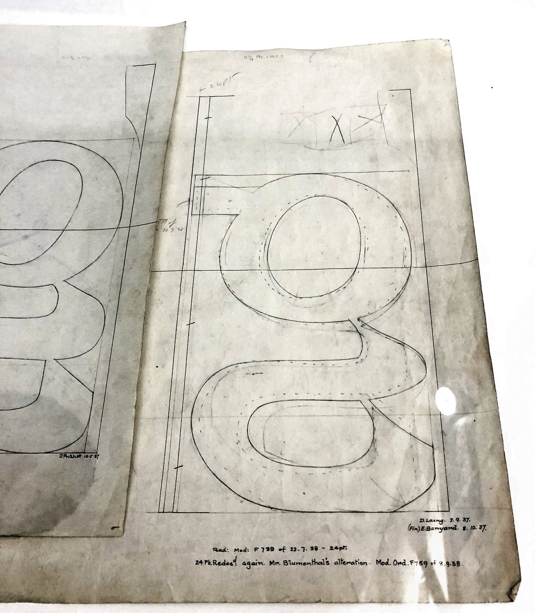
I note on a page of my project document that some of the lowercase letters in Albertus—like g and y—seemed cramped and had an odd flatness to them. I learned later from Toshi and then from viewing original Monotype mechanical drawings at the Wolpe exhibition this had to do with unit-width and other size limitations in Monotype casting equipment.
Before traveling to London, I had made contact with one of Wolpe’s children, Toby, who met me at the archive where Sue Shaw was touring Toshi and me, and he, Toshi, and I went off to pubs and dinner. One of the best days of my artistic and creative life.
It was part of what set me on the new path from 2017 of pursuing type and printing history as an increasing part of my professional life. I had the news yesterday that The Type Archive will be shut down in its current location and its archives components relocated—mostly put in storage. It feels an appropriate day to post my long-ago project.