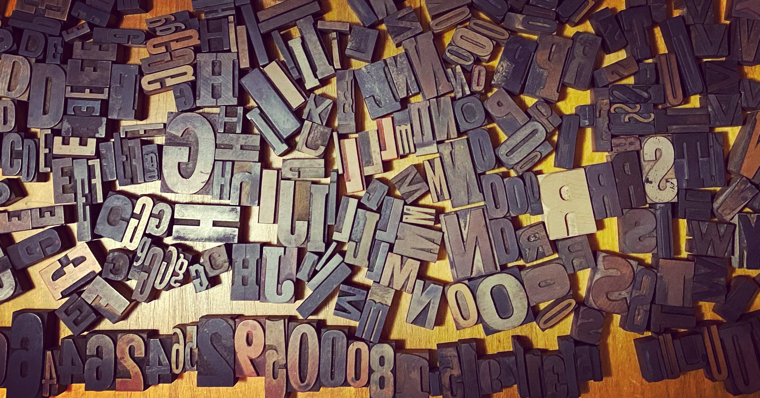
The Proof Is in the Printing


I’m currently in Lewiston, Maine, with Marcin Wichary, the author and designer of Shift Happens. I’ve been his editor and project manager. Having worked with Marcin for years on the text, we shifted into crowdfunding (raising over $750,000) and now into production. After we talked to many printers over a couple of years and received lots of bids, Marcin opted to go with Penmor Lithographics, a company in the United States we knew we could go “on press” with—we could actually travel to them and view the pages as they came off a press.
If he had selected a printer outside the U.S., it might have been more expensive or impossible to do a “press check” like this. We would have entirely relied on a printer rep managing our interests to ensure everything went as desired during the printing process. (We were also concerned about import tariffs and trade wars, shipping costs, international disputes over agreements, delays in freight, etc.)

In preparation for printing, a printer sends out proofs to the client. These proofs have changed tremendously in the time in which I have worked in print production, from the 1980s to the present. Here’s how it all worked and what we looked at in preparation for going on press.
Analog Offset Era
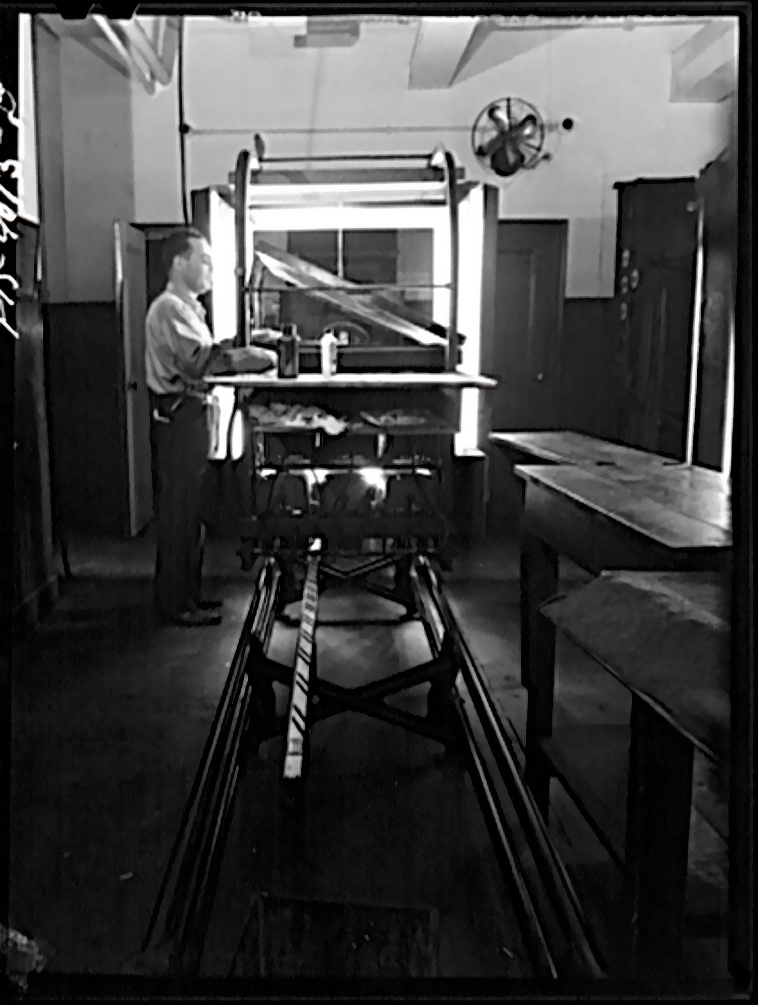
We would “paste up” typeset text on boards using wax (some shops used a glue that allowed repositioning) and mark “keylines” (red outlines) for where to place photos and sometimes line art. Photos and line art would be produced using a stat camera, which could interpose a screen for grayscale or color images or shoot a solid black for line art. (Offset printing, like ink-jet printing, can only print or not print—there are no tints for each solid color, like magenta or cyan.)
The boards of text would be photographed using a large-format negative camera, and then the images and illustrations would be “stripped” in by a stripper to form a single negative. That negative was then exposed under high-intensity light to a printing plate: metal coated with photosensitive material. The plate was developed, and then that’s what went on press.
The process is called “offset lithography” because when on press, the plate rolls through an ink bath, attracting ink only in areas that should be printed, and then rolls onto a rubber blanket, which offsets the printing by then rolling onto paper. It’s “lithography” as the process was developed out of stone-based (stone is lithos in Latin) lithography, invented around 1800; offset lithography came into being around 1900 and took a good 50 years to gather steam, and then replaced relief or letterpress printing almost entirely by the 1980s in much of the world.
(Before the 1980s, the process was similar going back a few decades. In the era of metal printing, however, proofs were all made through direct printing from the surface onto paper.)

A proof in this era was made through the blueline process, exposing the stripped-up network to a light-sensitive paper that, when developed, was blue—the same thing used to duplicate architectural plans. Blues represented an exact version of what the final result should look like, even though there was another step in the process.
Proofing full-color work or CMYK process printing (cyan, magenta, yellow, and black) required using special transparent material with a dye or int for each of those colors. Each negative, one for each color, would be exposed to the colored sheets and then composited to preview the color as it would appear on press. For spot colors, which are any colors other than the four process ones, it was unlikely you’d have the right color-proofing dye/tint. In those cases, if it were critical, a designer might need to get “wet proofs,” in which some stages of production were done—like color separating the images, stripping them into a single sheet, and making plates—to test the final colors. Given the expense, at other times, the first time a designer or production person saw the actual colors was during the press run, and changes could be simple to very expensive.
I worked in a printing plant in this era, where we were still working with paste-up and film stripping, even as the plant was in transition to the next stage.
First Stage of Digital Development

When laser imagesetters became practical at the dawn of the desktop-publishing era in the 1980s, you could take an onscreen design, rasterize it (turns vectors into bitmaps and scale bitmaps the laser dot size of the imagesetter), and have a laser paint it onto photosensitive resin-coated (RC) paper. That output could be entire pages or typeset copy still cut and pasted into place.
Soon, imagesetters could also expose film, allowing production of the final negatives with no stripping except putting pages together into larger “forms” for presses, which typically print several pages (like 4 to 32) on each side of a large sheet. (These sheets are called forms, historically and present, but also signatures, meaning a set of pages printed on a single sheet. Shift Happens is 38 signatures of 32 pages each, 16 per side of each sheet, to make 1,216 pages total.)
When you imageset to film, you’re reducing a generation of reproduction: there’s no negative photography of your pasted-up pages. As a result, the printing matches the original more closely, as there’s always some transformation in each generation: thins may be lost, thicks get thicker, and halftone dots grow slightly or the smallest ones disappear. It was an art to shoot negatives, and suddenly there was no need to.
Proofs in this stage would largely still involve bluelines and color-dyed transparencies. Because the output from an imagesetter (or “filmsetter”) was from a digital source, you could mostly but not entirely rely on proofing with a laser printer. An imagesetter could produce 1,200 or 2,400 dots per inch (dpi) while most laser printers were limited to 300 to 600 dpi.
However, a laser printer had a different raster image processor (RIP) than an imagesetter. In the imaging centers I worked in—one in a printing plant and another, a freestanding service bureau—we had a separate chunk of hardware that did the rasterizing for the imagesetters. In contrast, laser printers of the day had RIPs built into their hardware. (Some people used PC-based RIPs that provided different features.) Differences in RIP software would often produce different results in output, some subtle and some huge, including errors or incorrect interpretation. That made laser printing closer to a rough proof, leaving bluelines as the gold standard.
(Note that the RIP converted Adobe PostScript, the industry standard for fonts and vector art, into bitmaps. Adobe licensed PostScript to RIPs for a pretty penny, so some companies developed PostScript clones that worked almost but not quite identically—a laser printer might have licensed PostScript and an imagesetter RIP a clone.)
A related issue when you switch to digital is that you’re looking at color on an emitted medium, the display shows only RGB or the primary colors, instead of the colors in a developed photograph, which are closer in nature to an image printed on press. CMY are the complementary colors to RGB, each of them being subtractive or reflective colors: cyan is what you see when red is absorbed, magenta for blue, and yellow for green.
The gamut, or range of possible colors that can be displayed, is substantially different for RGB than CMYK, and there are many kinds of RGB and CMYK gamuts, depending on display types and inks used. Both RGB and CMYK carve out different areas of the visible spectrum. Newer RGB profiles for more sophisticated modern screens can show a larger gamut, bringing the display closer to a simulation of the printed page—though still emitted instead of absorbed. A screen can’t simulate matte paper, either. CMYK gamuts are far smaller than RGB, but they don’t fit as a subset entirely inside all RGB gamuts. (See this reference article with illustrations.)
The K, for key plate, as it’s the one used for alignment and is typically the one used for the heaviest amount of ink, is used because it’s impossible to create pure CMY pigments. If you mix CMY, you should get black, but in the real world, you get a muddy brown. It’s also a lot of ink coverage for a poor result: 300% (100% of C, M, and Y), which is hard to print and wasteful.
Digitally separated CMYK relies on “undercolor removal” and “grayscale component replacement” (UCR and GCR), both of which reduce the amount of CMY ink in favor of black: UCR replaces CMY with black, while GCR replaces mid-tone neutral grays created by a mix of CMY with mid-tone grays produced from black ink. Both UCR and GCR can be adjusted by photo and by project. Depending on the press, paper, and purpose, an image, graphic, or type with two to four colors might be printed in pure black or at a mix of 150% to 300% of inks, including black. This affects the richness of the tone—blacks are black, but adding other colors and screening the black back slightly can shift the tonality to make it a warm or cool black.
“Soft proofing” developed as a concept of calibrating a monitor, using software, and having the right ambient lighting so that what you see on screen is as close as possible to simulating the ultimate print result. I spent a year or so in the early 1990s using a fancy calibrated monitor under a lighting hood to perform color correction as part of the “prepress” phase before we output to film and then made color proofs. We could then check the proofs under the same light.
The Modern Digital Proofing Era
The last stage of evolution was moving from film directly to plates: platesetters began to appear by the early 2000s that laser etched dots directly onto the plate material that went on press. This brought production down from three generations or more (getting to a positive item you pasted up, shooting it on negative, exposing it to plate) to what you could call almost zero: digital output direct to an analog result with no photographic intermediary—almost no optical spread or interference. (This is also the time when prepress moved largely from designers and production houses into printing companies: delivering a file was the last stage instead of delivering paste-up boards, slicks [flat sheets], or negatives.)


At the same time, printing companies developed a split RIP process: the same RIP could drive a laser printer and a filmsetter, then a platesetter. This meant you could get a pixel-precise preview on paper that was identical, dot for dot, with the platesetter output. These are often called “digital bluelines” because they’re printed from a digital source and replace bluelines. The printing industry is riddled with historical terms that are baffling to newcomers who didn’t work across eras.
Instead of using color dyes and films, proofs are made by printing to color-calibrating ink-jet high-resolution printers. These proofs provide a very good preview of the color range and detail, but they’re still not precisely the same as being on press because the proofs are made on particular glossy paper stock for calibration reasons. If the paper you’re using for a project is also glossy (called “coated” paper), it may match more closely than “uncoated” or matte paper. (There are semi-glosses and other finishes, too.)

That’s what we’ve been looking at with Shift Happens. Digital bluelines arrived in May, and color proofs followed. Marcin assembled a list of corrections and concerns from the bluelines, which I also reviewed and added my two cents, and sent those to the printer. Once the printer takes custody of the files and starts putting them into their production pipeline, including using their in-house workflow for RGB-to-CMYK conversion, they make all corrections and changes to avoid any issues that could result in unexpected outcomes.

Marcin managed reviewing the color proofs as he had assembled and corrected the images in production, some starting years ago. We learned a fair amount in this process about minor differences in source Photoshop files causing major differences in the CMYK transformation chain for black-and-white images that Marcin had applied a tint to. He wanted to have a consistent, rich color cast on many of the B/W images. Marcin had to work intensively with the prepress department at the printer to find the right balance and bring all of these images into the same color family.
I’ll write more about being on press later—this is just the warm up.