The Printer's Devil #1
Thank you all so much for being part of this grand new experiment in something quite old: patronage! While I’ve participated in crowdfunding before—launching four projects and backing many dozens—this is the first time I’ve looked into recurring support that has small, ongoing goals.
I have many illustrator and cartoonist and comics artist friends (some who are all three) using Patreon very effectively. It’s easier in a visual medium to reveal working methods and extras. Writing is obviously very different—you probably don’t want to see my drafts, oh my, or a list of all the words I considered and discarded as synonyms. But I’ll be trying to bring some of that idea of freshness here.
The first goal of $250 a month, which I set to write a monthly newsletter, hasn’t yet been hit. But I’m starting anyway, given that I’m well on the way towards it. Weekly newsletters for those contributing $5 or more a month will come later as I approach or past $500 a month. (I’m sure I’ll send out bits and pieces before then.)
(If you’re not a patron and you received this newsletter from a friend, hello! And consider becoming a supporter. I’ll be writing monthly and weekly newsletters full of interesting stuff, and writing original articles exclusively first for patrons. You can find out more about my campaign at Patreon.)
ABC: Always Be Composing…I mean, Writing!
I’m always writing, something I think defines a writer, just like any artist or creator can’t help themself from always making art, music, circuit designs, and the like. Most of my words don’t wind up anywhere, and I’m delighted to share a hunk of those with you. It’s a creative release, and I’ll be able to tell stories here and know that people want to read them.
A quick note about the title of this newsletter. If you’ve heard me on podcasts, you surely know that I was trained as a typesetter in the 1980s. It became a largely obsolete profession, though the principles still apply to composing type. Most typesetters now call themselves typographers, designers, or layout artists. Typesetting had a nearly 550-year span as a good living!
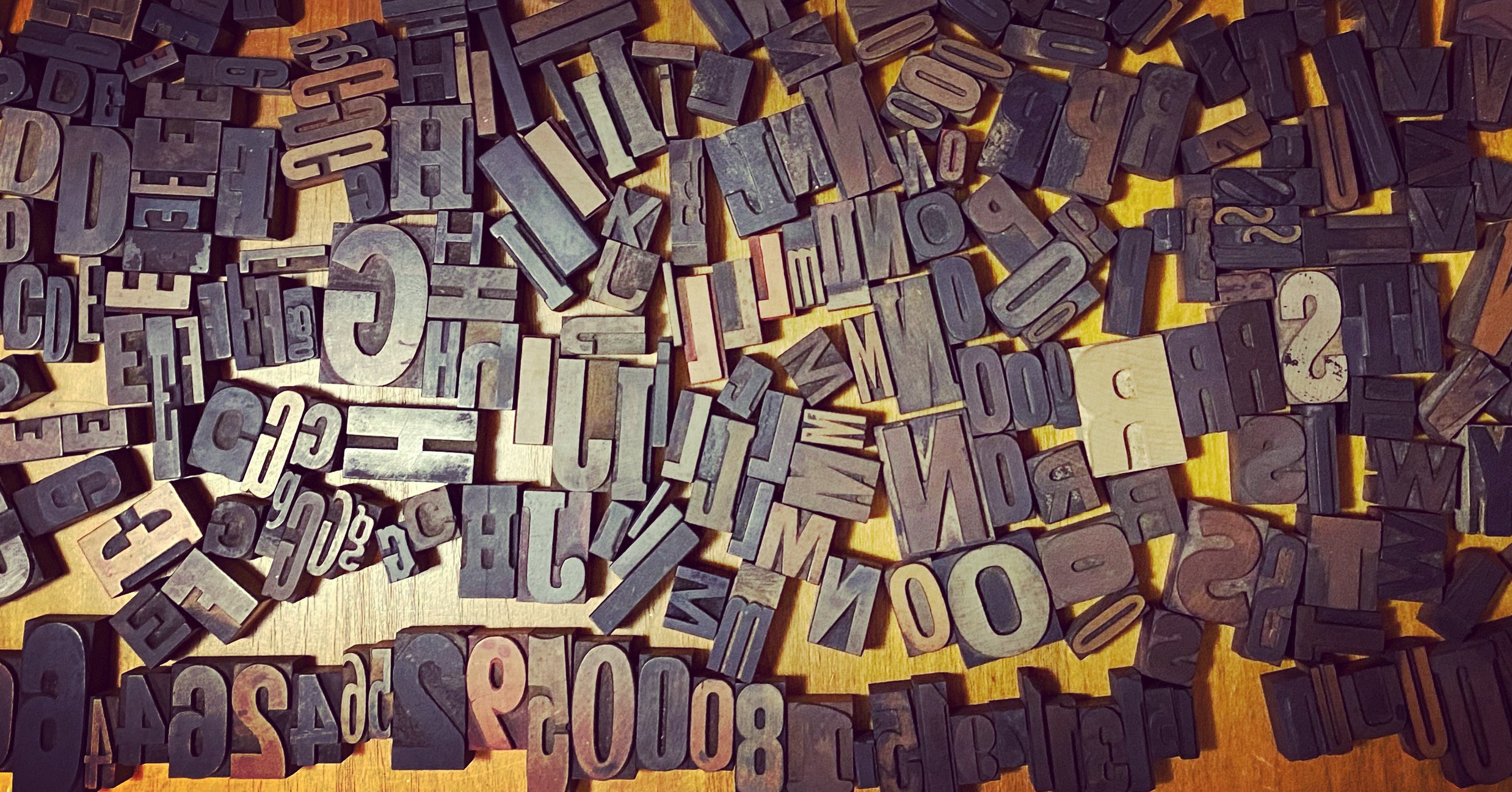
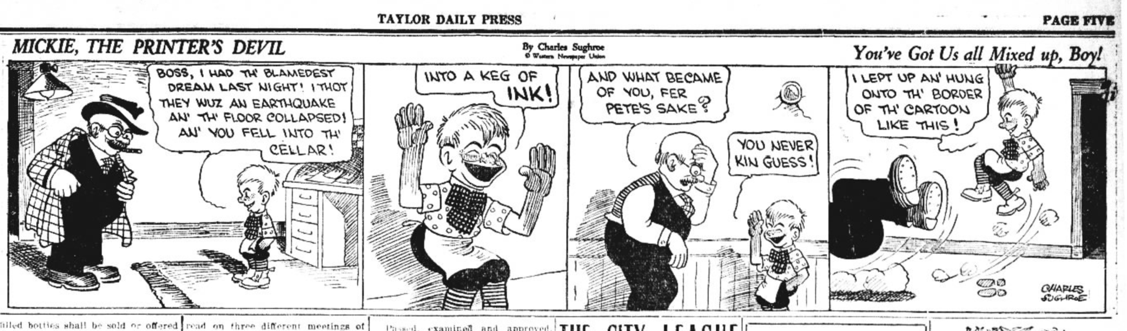
In typesetting shops, there was always a lot of mess. The clean up and management of that scut work was left to the printer’s devil, often a small boy far below today’s legal child employment age. The printer’s devil had to deal with “pied” type (mixed-up letters) from the “hell box,” sorting it back into the proper case compartments. It was a starting job for many who wound up in journalism or as authors. The profession was so commonly understood that there was a comic strip called Mickey, the Printer’s Devil that ran in the 1920s and 1930s.
ast year, I was having dinner with a man in his 90s, a friend of my in-laws, and it came up that he’d worked in printing. In fact, he’d been a printer’s devil as a child, and explained to the table how he had to avoid being squirted with hot lead by balky Linotypes. (Being burned by a scalding lead amalgam was a constant fear of typesetters on certain equipment. I will write more about the difference between Linotype and Monotype setters later!)
I thought my interest in cleaning up around the edges of stories, finding the stuff left behind that has its own value, meshed nicely with this historic job.
However, I swear to all that is holy and righteous, I won’t be writing only about type, typography, and printing. But I will start with it!
An oblique reference
I have a complaint about italics, but it requires a little exposition.
The evolution of modern Roman alphabets is something I keep learning new facts about, even 30 years into studying it. Upper and lowercase came about as separate branches that both derived from letters chiseled into Roman stonework. These capitals on Trajan’s Column had winding journeys as separate purposes: the uppercase turning into formal manuscript writing, but also sparking a humanist, flowing, cursive hand that became lowercase.
In the same way, roman type (that is, upright letters, and spelled lowercase) and italic type had different journeys. Roman evolved from capital letters and one kind of script (Carolingian minuscule); italic comes instead from a form of cursive writing. Italic alphabets in a type family are always drawn separately from roman, just as bold and other weights are.
For hundreds of years, type designers either cut their fonts directly or worked side-by-side with craftspeople who did. Every size and weight had to be designed and cut separately. The invention of the pantograph in 1603 was a breakthrough; a pantograph is a set of connected arms that allow drawing or tracing with the tip of one arm and having an enlarged or reduced version engraved or drawn at the end of another. A type designer could make one set of drawings and then adapt them with mechanical perfection to other sizes.
Linn Boyd Benton invented the modern pantograph in 1884, which allowed cutting the metal punches directly from which type was made. It also enabled mechanical expansion, contraction, and slanting or obliquing of type, which broke the relationship between a designer’s hand and the final result. (Hard punches were hammered into more malleable metal to make molds into which the mix of lead, antimony, and tin were poured to create type used to print.
Designing type isn’t a mathematical operation. It’s a combination of aesthetics and insight: legible type for the body of a book or periodical, in particular, has to meet a number of marks based on people’s visual capabilities, neural processing, and implicit matching against what they’ve seen before.
I saw this fascinating behavior with my older son, now almost 12. At age 1, he learned his alphabet, which was unusual. However, he learned it from a single set of wooden letters that fit into spaces in a puzzle board. My prediction was that his knowledge was specific to those letters, not generalized. This turned out to be true. I also expected he would lose his alphabet and regain it in a general fashion, which is also what happened. (I’m not usually that good at prognostication, but I know about letters!)
When most of us learn to read, it’s the gradual accumulation of the generic idea of what each letter is. I don’t know enough about ideograms to explain that process, which seems much more complicated neurologically, but readers have to know an “a” whenever they see it in whatever font it appears. A subfield of psychophysics—a field of study about the relationship between stimuli and our responses and understanding—focuses on legibility and the limits of it, and looks into how we generically recognize letters. (Psychophysicists who study legibility pair neatly with computer-vision researchers who train systems to read, and the two disciplines sometimes work together.)
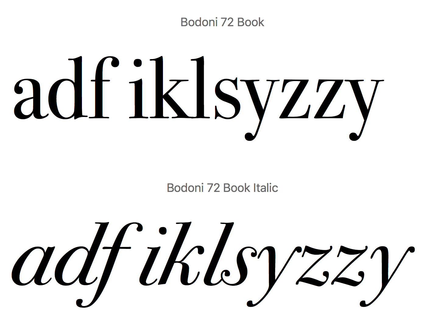
Desktop publishing in the mid-1980s gave typographic tools to the masses. But with great power comes great distortion. Early software made it easier to take a drawn roman font and oblique it, producing fake italic. With serif faces, those that have tiny bars (the serifs) and have a stroke width that varies across an axis, the drawn version is italic; with modern sans serif faces, which have more even strokes widths, the drawn version is called oblique, and it looks much more like the upright version.
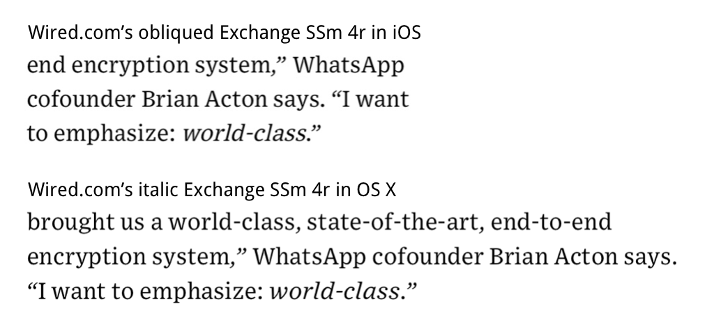
I saw two slightly different examples of this recently, which provoked this line of thinking. Wired magazine has a mobile display problem: the true italic for Exchange SSm 4r shows up in a desktop browser, but in Safari for iPhone it’s replaced by an obliqued roman. (Here's the article in which the obliging occurs.)
The sure giveaway, if you haven’t spent your life staring at fonts? The lowercase a in a serif font, like Palatino or Bodoni, almost always has an open area at the top above the bowl. It’s much harder to tell with a san serif face.
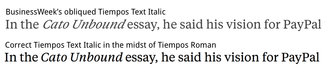
Bloomberg BusinessWeek demonstrated a different problem—let’s call it hyperobliquing. The proper drawn italic face appears (Tiempos Text), but it’s also obliqued! This drives typophiles mad, as we can see it’s wrong, but it’s even harder to explain to civilians.
Don’t get me started on straight and curly quotes. (That’ll be in a future issue.)
This newsletter is intentionally full
Over at Meh.com this week, you can read up on the history of “this page is intentionally left blank,” something that might seem like a recent invention, or at least part of modern history. In fact, with the help of some antiquarian and classics colleagues, we traced it back to 1471 c.e. in an early printed book. (This is the sort of article you will see me right here first, and possibly exclusively!)
Charging for the public domain
A story appeared a couple of weeks ago about a lawsuit filed by Carol Highsmith against Getty related to that photo agency licensing her images. The problem? Getty doesn’t own the rights. Highsmith donated her rights to the Library of Congress starting in 1992. The reason she became aware of this problem is when a licensing-compliance firm sent her a demand notice to pay for her use of her own photo.
What is interesting about this story isn’t that Getty is trying to extract money for copyright licenses it isn’t authorized to enforce. That could be bad record-keeping. Rather, it’s that Highsmith’s lawsuit and the Library of Congress’s internal information about the collection differ.
Highsmith says she retained her copyright and donated the images for the free use of the American public to the Library of Congress. The LOC’s rights page for the collection, however, says the images are in the public domain. There’s a big difference between the two. If she donated a license that specifies use, she retains other rights; if she signed the work into the public domain, through the offices of the LOC or otherwise, she can’t control the work any longer at all.
Getty (and anyone) can give away or sell images in the public domain. But it shouldn’t be able to represent itself as having rights nor collecting fees based on the enforcement of those non-existent rights. The expert I spoke to says, Getty is accused of violating section 1202 of the Copyright Act, which “prohibits removal, modification and falsification of copyright management information.”
That’s a reason that Creative Commons came into existence about 15 years ago: to provide enforceable, well-written licenses that allowed broad but not unrestricted use by other parties that fall short of the public domain. Calling something a public gift and not putting it in the public domain leaves ambiguity.
I’ve queried the Library of Congress about the matter and a leading expert in the public domain. This might wind up being the first story patrons get before anyone else when I uncover more details.
A little lark
As I gear up to write more short work for patrons, I cracked my knuckles and wrote this reply to a friend on Twitter to his critical question: can Wolverine (of the X-Men) use Bluetooth headphones?
Richard Thompson passes away
One of the greatest cartoonists of all time, Richard Thompson, passed away in late July. His strip, Cul de Sac, was never well known enough, despite five in national syndication. It hadn’t permeated our culture yet, though it deserved to. It was a more gentle cultural successor to Calvin and Hobbes, and Bill Watterson loved Thompson’s work. Richard discovered he had Parkinson’s Disease around 2008, and continued to work while it progressed. He had to give up the strip in 2012, and then we lost him altogether.
I had the great pleasure to talk to him for a Boing Boing article in 2012, and we exchanged tweets and emails for a bit after that on other subjects. He was a truly lovely person, and had an impact on the lives of many other cartoonists, to whom he was always generous.