Book Printing Update
I write about finishing up the printing of the interior pages of my letterpress book over at my printing sub-blog!
I write about finishing up the printing of the interior pages of my letterpress book over at my printing sub-blog!
Terrible news. Apple is replacing the long-running convention of typing two hyphens to obtain an em dash or “long dash.” That is, if you type --, many places in the interface in which autocorrection is enabled or third-party software takes advantage of autocorrection, it’s turned into —.
Instead, two hyphens become the shorter en dash, or –, which you may never have heard of if you’re not a print or Web designer or otherwise interested in the intricacies of formatting things. To get an em dash, you will have to type ---, a convention that also appears in TeX, a mathematical formatting language developed by Donald Knuth.
Update: In the release version, Apple contextually replaces -- with — (em dash) to connect words when you type with or without spaces on either side. If you type a number and two hyphens, it turns into a – (en dash).
Why is this terrible
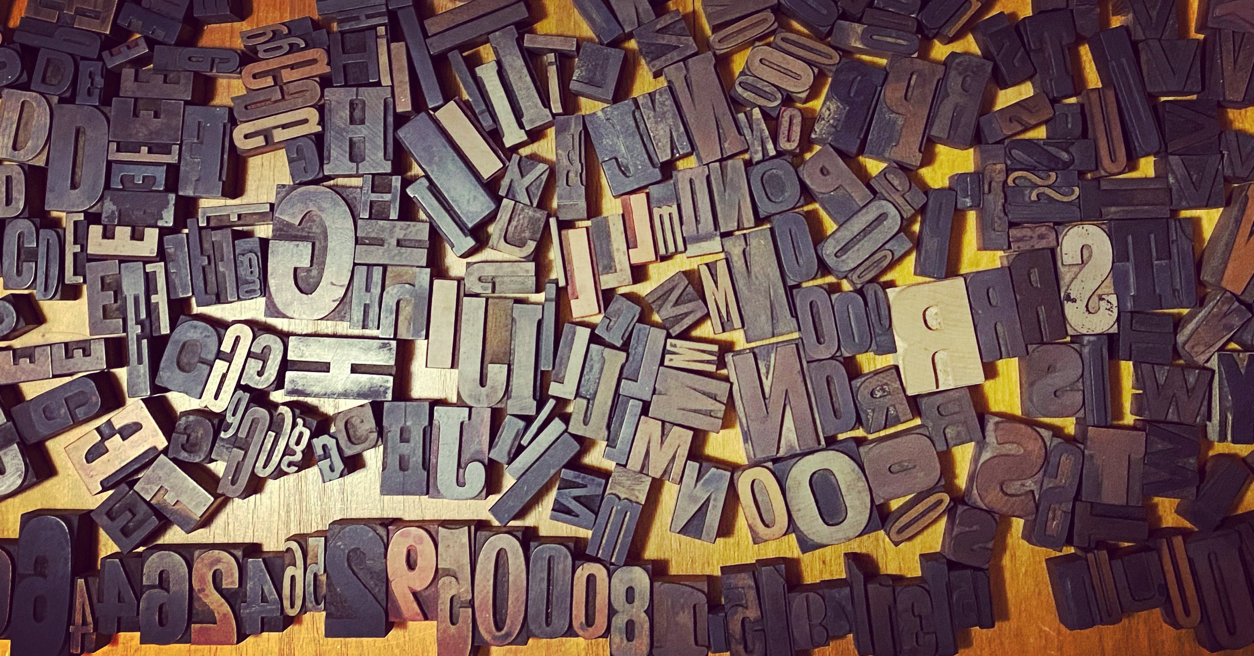
I just saw the movie Graphic Means last night at its world premiere, and I am so excited about it. It’s about the history of graphic design production during the transition from the hot metal era to high-quality digital output. I worked part-time as a typesetter from around 1984 to 1989, and then as a compositor, imaging center supervisor, color separator, and graphic designer part- to full-time from 1989 through the late ’90s. I lived through this transition, in which major changes could happen every few months. It was delightful to see that period so well explained, and learn a lot of new things, including how phototypesetting was opposed by unions and how it provided an entrée for women into the printing world.
Graphic Means is in limited theatrical release before it goes to digital downloads and DVDs. So I have recommendations for other books and movies:
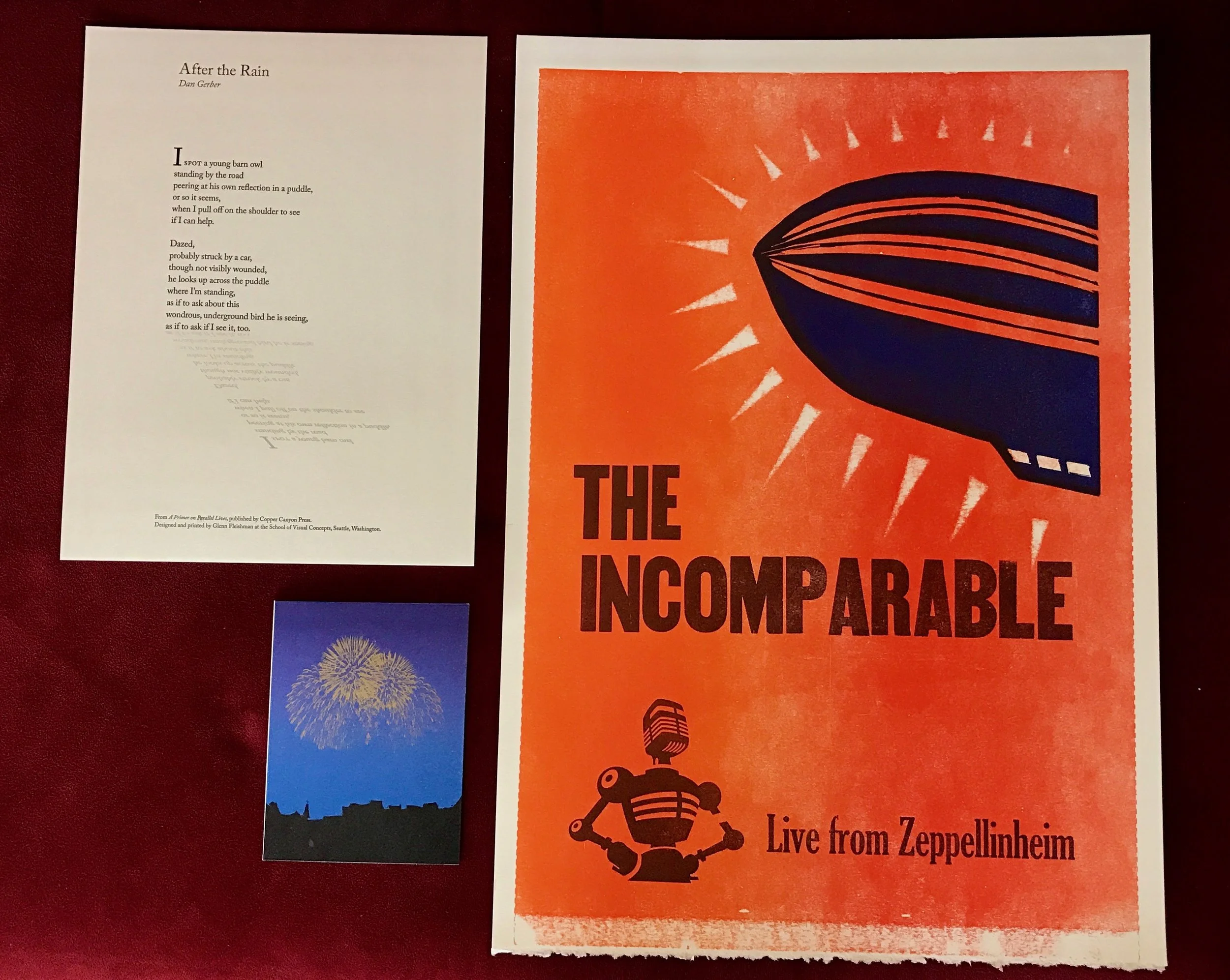
The collected work from my first quarter at the School of Visual Concepts as its designer in residence from the three courses I took. From upper-left, clockwise:
The spring quarter starts this week, and I’ll be taking a single

Thanks so much to everyone who backed my "Hands On" project — and those who sent good wishes and moral support!
With the funding in place, I'll be moving on to next steps, and post a message to backers with the site information to follow the book’s progress. I’ll be posting some updates and photos publicly, and others just for those underwriting this project.
Upcoming steps will be working further on a preliminary design to have test plates made from which I can print on various paper under consideration and then finalize the design. I'll post sketches and results when interesting. I’ve committed to writing one more article for the book (about the Georgian language’s treatment of capitals), and need to flesh out another, on printer’s devils — aided by meeting someone whose husband worked as one as a teenager several

My labor of love the last two years has been The Magazine, first as its hired hand and then, in May 2013, as its owner. The sad truth has been that, while profitable from week one, the publication has had a declining subscription base since February 2013. It started at such a high level that we could handle a decline for a long time, but despite every effort — including our first-year anthology crowdfunded a bit under a year ago — we couldn't replace departing subscribers with new ones fast enough. We're a general-interest magazine that appeals to people who like technology, and that makes it very hard to market. "Pivoting" to a different editorial focus would have lost subscribers even faster. (Ads wouldn't work; we simply don't churn out enough content for that model. I wrote this a year ago and it's still true.)
So we lasted as long as we

We funded The Magazine: The Book! Thanks to everyone who backed the project. I chose to go to Kickstarter to ask for a combination of pre-orders and general financial support, because coming up with the nearly $50,000 to make the project work was a tall order. By turning to readers, friends, and colleagues who wanted to help and/or get a book as part of the deal, it means 100% of the cost is covered before going into production.
It also meant we could stretch. The book was originally planned as a 200-page hardcover with good binding and a 200-page ebook that was exactly the same. But because we shot past out $48,000 and hit a $55,000 stretch goal (and even exceeded that), we can afford the reprint, design, and production fees to create a 300-page ebook, and to upgrade the hardcover binding to something a little
The Magazine: The Book is nearly at 50% of the goal we need to make it happen.
Kickstarter campaigns can follow a few arcs.
They can flatline, which is about 20% of them, last time I was able to get statistics. 20% of all projects approved by the company get no bids. Another 20% get less than one-fifth of the way to their goal amount. 16% of all projects fail between about 20% and 50% of the total amount they plan to raise.
But at the halfway mark, when you raised 50% of your total, the odds are pretty dramatic: 97% of Kickstarter projects that fund halfway proceed to fund fully by the end of the campaign.
We're about 48% of the way to our total, and I'm confident that, as we hit our last 12 days, we'll start to see some steam as people both see that it's coming

You may have already heard the news: I've purchased The Magazine from Marco. This is a great day in my professional life, as The Magazine is one of the very best things I've ever worked on. This is partly because Marco gave me an enormous amount of freedom in editing it, and partly because I get to work so closey with writers on their work.
I love writing, and have appreciated all the time and effort my editors have and continue to put into making my words work in the right order. It's great to work with both new writers and experienced ones to try to find the sculpture inside the block of marble.
It's been great working with Marco, who is an exceptionally decent human being, and overflows with different facets of creativity. He's been the art director, taking photos for the publication (he's got
I had a lovely time at a two-day type conference at the School of Visual Concepts in Seattle a couple weeks ago. One day of lectures, one day of hands-on workshops. It was heaven for me, as my first love is type and typography, but I was never accomplished enough to devote my life to it. That doesn't mean I can't love it.
Day 1 was terrific, as I learned quite a bit about the history of foundries and a few prominent (and less known) designers. The last lecture of the day was by Sumner Stone, talking about his history in digital type design, telling some previously unknown stories, and showing pictures of associated folks. My late design teacher Alvin Eisenman was in a few shots, and my senior project adviser Min Wang, too. I found out Min is now the dean of a prestigious design school in Beijing! He