Woodn’t It Be Nice?

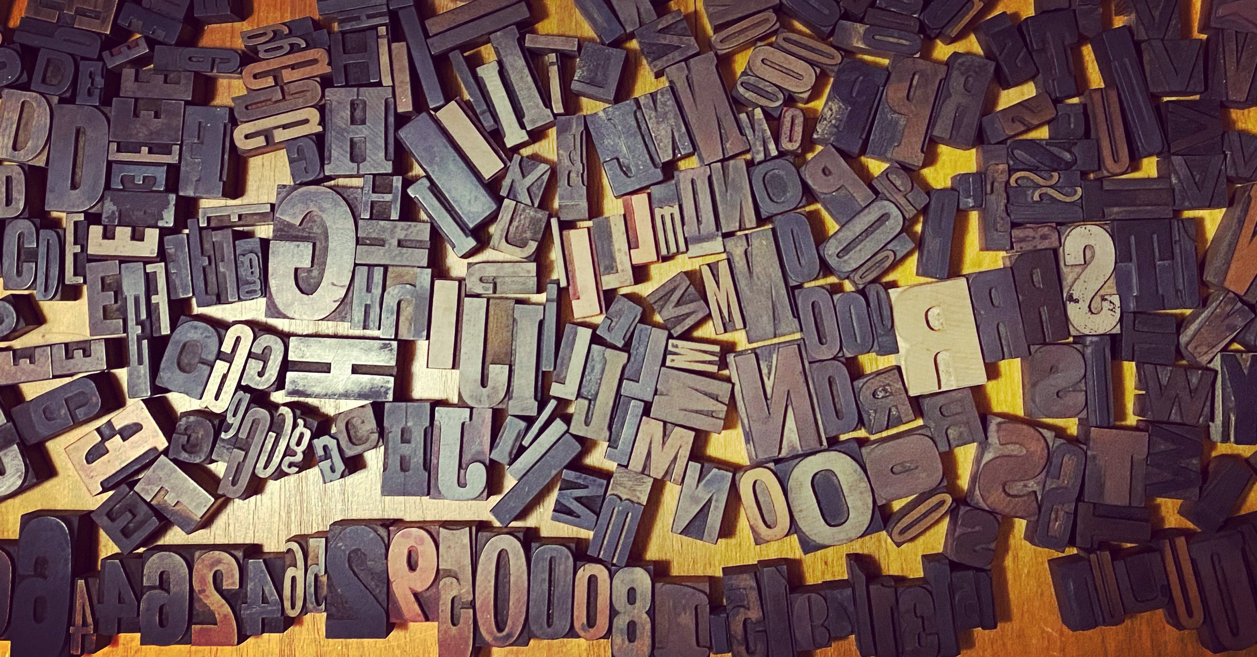
A key aspect of printing history is the development and evolution of wood printing type. It’s a reason why every Tiny Type Museum & Time Capsule will have at least three kinds of wood type included.
Some wood type background
There’s a strong suspicion and good historical evidence that the earliest printing, at least 1,000 years before Gutenberg, involved entire pages carved in wood in China and elsewhere in Asia, and later movable wooden letter blocks.
However, logographic languages like Chinese, Japanese, and Korean had a significant bit of overhead: often at least thousands of unique characters are required for a book of any length. The diversity of logographs in the language overcame the benefits of movable type versus carving entire pages for wood-block printing. Gutenberg may have been a genius, but he had the advantage of requiring roughly 23 characters for Latin and German with some diacritical marks (and for fitting, many, many ligatures).
Metal movable type was the nearly the only method to put type on paper using a press from Gutenberg’s invention through the 1800s. (Really, Gutenberg re-invented what Chinese, Korean, and potentially other printers already had developed, but it’s unlikely Johann knew about it.) It was difficult to cast large metal type—above, say, 36 points, for several reasons. Metal type required a punch, or a carved, raised image of type. These punches were made of steel carved by slightly harder steel and then hardened themselves. A large punch was difficult to produce, but then it had to be struck into a copper or brass planchet, the material for a matrix, which contains the mold used to cast type. The bigger the punch, the harder it would be to make a good, clean strike.
Even if you’d succeeded in creating a good matrix, until the mechanized Bruce typecaster was invented in 1838, all metal type was cast in a hand mold, which required manually pouring hot lead into the mold and giving it a snap with the wrist to fill the type mold and its shaft completely. For larger sizes it was hard to not leave voids or incompletely fill the face. Some foundries used hand pumps, which helped. But metal still had an issue of warping as it cooled unevenly at large sizes that could be used for headlines and advertising. (If you wondered looking at old newspapers why the headings are so small, this is the reason.)
It’s into this void that wood type entered. In the 19th century, the use of prepared end-grain wood for engraving illustrations became routine, a change from the focus on metal etching in the previous couple of centuries. Wood was an easier material to work with, but had been abandoned in favor of the precision of metal. Wood could also be locked up with type or printed on the same letterpress equipment as type, while engraved metal plates had to be printed by intaglio, a method in which ink is forced into incised lines.
The demand for illustration came from the massive growth in newspapers across that century: the number of papers, the number of pages in each edition, and the copies printed for each edition grew prodigiously. This required more illustration and supplied the cash to pay artists. This led some type manufacturers and experimenters to begin to create methods of effectively and rapidly carving wood type for headlines and then for multiples of interchangeable, reusable letters.
You can read a lot more about the history of wood type in the reprinted edition of Rob Roy Kelly’s American Wood Type: 1828–1900. Why 1900? That was the end of this phase of the author’s intense historical exploration. A second volume would have made sense, but he never produced one. Wood type reached an apex around 1920, according to a few sources. It was still manufactured for decades to come, but increasingly replaced by other methods of type production and reproduction.
Something old, something new, something else new
To celebrate the importance of wood type across printing history, each Tiny Type Museum features three kinds:
A piece of historic wood type. I’ve acquired mixed lots of type from a few sources to avoid breaking up complete fonts (a set of letters of the same size and style) that could be used by current letterpress printers. This type dates from the 1870s to the 1950s.

A piece of modern type made with historic methods. I contracted the Hamilton Wood Type & Printing Museum to create a capital H from the typeface Brylski using a pantograph, a motorized wood “tracing” device that allows a pattern to be sized up or down as it is cut. Brylski is a modern wood-type design by Nick Sherman that echoes historic faces and is also available in digital. The face is named for Norb Brylski, who spent most of his adult life working at the Hamilton plant carving type, then returned as a volunteer for the museum when it restarted. He passed away at 93 in 2014. This letter H was produced by a team of three volunteers: Bill Peters, David Carpenter, and Georgeann “George” Liesch—Norb’s daughter!

A piece of history type made with modern methods. Scott Moore of Moore Wood Type seasons and prepares wood for both pantograph and laser cutting. I ordered paired sets of printer’s fists, sometimes called manicules, derived from an old UK specimen book.

As I noted in an earlier post, one or more pieces of type in every font of wood type would be stamped with a maker’s mark. Type historian David Shields has made a study of these marks, as they allow dating wood type sometimes to within a few years. (Some faces were made or revived across many decades.)
When Scott was getting ready to laser cut the fists, he said that his mark could be included (which I wanted), and asked if I wanted one for the museum as well? I quickly designed a small mark in the style of the metal stamps used historically (see below) as you can see in the photo above.
